Common actions
Content
Actions should always clearly communicate their purpose by using a text label, an icon, or a combination of both.
See fundamentals for more detail.
Use icons in place of text for common actions. Leveraging pre-existing knowledge will improve clarity and help reduce clutter, since these icons require no text label.

Keep labels short and concise.

Add unnecessary words to the action label. Instead, use context and placement to communicate the outcome of an action.
Place icons to the left of an action’s label.
Use an icon that represents the verb when a label includes multiple words.
Use the appropriate icon to reinforce the message when referring to a specialized or complex action.

Reflect the object type in the action’s label using the verb + noun format.

Use an icon along with the text label for common actions displayed within an action list.
Visual hierarchy
Style and placement help visually communicate the importance of an action on the page.

Use secondary or tertiary buttons to give actions less emphasis while making them accessible for as many users as possible.
Actions in editors need an additional level of emphasis to attract merchant attention and establish hierarchy between elements.

Use the emphasis color role for actions in editors.

Use primary and secondary buttons to help merchants identify which action they’ll most likely want within a given view. See card layout patterns for more information.

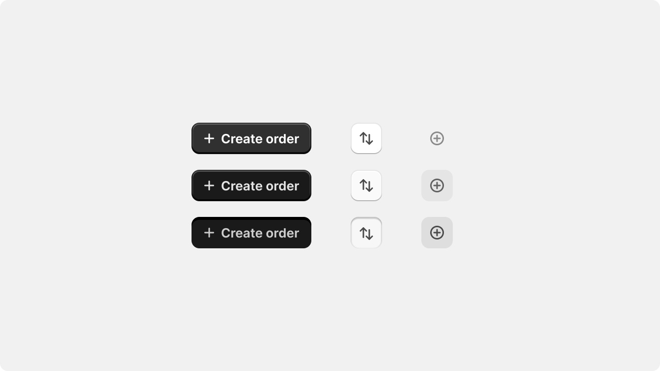
Use a tertiary icon button for items and rows in a list or table.

Avoid using more than two shaped or filled buttons within a card as they can degrade hierarchy and cause confusion.
Interactivity
Elements that are visually similar behave consistently throughout the interface. Consistency in behavior reduces confusion and cognitive load for merchants.


Make focus rings visible when a merchant is using the keyboard to interact with the UI.
Make focus rings visible when a merchant is using a cursor to interact with elements.
Use disabled styles for elements that the merchant can interact with.

Rely on color alone to indicate interactivity.
Platform considerations
Use interactions native to the device and type of input the merchant is using.
Desktop
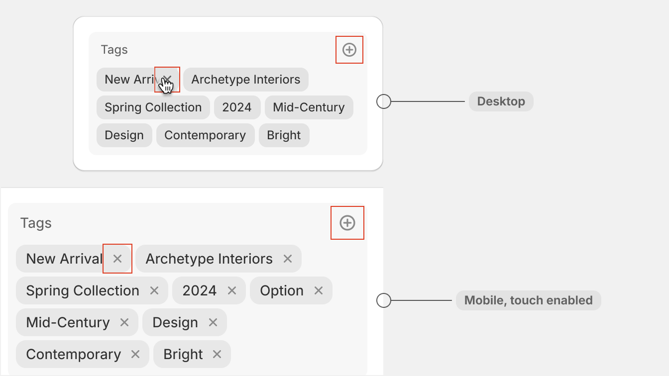
Actions on desktop and mobile should consider both cursor and touch interactions, but the primary interaction for the desktop is cursor-based. Take advantage of added real-estate and interactions by using progressive disclosure to expose actions in context when the merchant needs them.

Show list item actions like edit, delete, copy, and remove on hover.
Mobile
The primary interaction for the mobile is touch-based. Optimize for touch enabled devices by considering placement and target size of actions.
